For better designed development, we’re going to need a better code

[highlightrule] Charlotte’s strong urban planning is torpedoed by weak urban design. To change that, the city needs a new type of zoning ordinance.[/highlightrule]
Add together Charlotte’s apartment boom plus the reinvention of urban districts such as South End, Plaza-Central and NoDa, and you come up with a lot of questions. Residents complain about the neighborhoods’ changing character—inevitable in America’s freewheeling, market-based economy, but requiring strong zoning codes that promote good growth and protect neighborhoods from poor development. Other questions include: “Why do the new apartments all look the same?” and “Why are they so boring?”
Two main factors create this monotony:
- The confluence of building regulations with financial logic and profit.
- Weak zoning ordinances that lack urban design principles and fail to protect the character of our communities.
Building regulations and development finance
Apartments need parking, and in tight urban sites this means an expensive, fireproof, concrete parking deck designed in one of two ways: “wrapped” by apartments (imagine a rectangular doughnut with the parking deck in the hole), or a “podium block,” where apartments are built over a concrete parking podium with one story at street level and perhaps another underground.
U.S. building codes allow up to five stories of apartments to be built in cheap, lightweight timber construction of stud walls and plywood panels. Residential buildings of more than five stories must be built in much more expensive concrete or steel. If the timber apartments wrap the parking deck, the overall development height will be five stories. If the five stories of “stick-built” apartments sit atop a concrete parking podium or over steel- or concrete-framed street level retail (in the few locations where this works in Charlotte), the end result will be a six-story building.
Weak zoning ordinance
Charlotte’s weak zoning code, with its countless “Band-Aid” amendments, is not up to the task of regulating growth. In spite of this, the city does a lot of good urban planning, encouraging higher density development along major corridors between lower density residential neighborhoods. In this way, urban corridors such as Central Avenue and South End become resources for the whole community—as destinations and as corridors of connection via public transit. By focusing growth and higher density development in locations like those, the nearby residential neighborhoods can be protected.
But those achievements on good urban planning are torpedoed by poor urban design.
[highlight] Urban design focuses not on specific buildings but on the spaces between the buildings—the streets, parks and plazas that make up the democratically shared spaces that we all use.[/highlight]
Urban design deals with the functionality, beauty and safety of what we urban designers call “the public realm,” that is, the spaces between buildings—streets, plazas and parks—that make up the democratically shared spaces that all citizens use. Urban designers are interested in buildings, but not as sculptural objects, the way most architects are taught to see them. Rather, building façades become walls to outdoor “urban rooms.” Building interiors have busy and quiet areas, public places like lounges and canteens, and private areas for individual work and study. They have hallways lined with rooms, corridors for moving, and windows that frame views. Urban design has all those things, too, but out in the open air.
Streets are the hallways. Plazas are the public lounges. Individual buildings are the rooms. Parks are the gardens. Spaces between the buildings frame the views, like windows. That’s why the way building façades “address the street” —how the private realm of the building’s interior faces the public world of streets and plazas—becomes very important.
We judge an urban neighborhood by walking around it, getting a feel for its human scale and looking to be entertained, informed or stimulated. Key to our perception of community character is how buildings frame these spaces, with welcoming grace and proportion or blankness and hostility.
To make sure we get those things right, there’s a technique of urban design that every architect, landscape architect and developer should know. It’s the “Golden Triangle.” The triangle is the zone of space at the sidewalk, drawn vertically by the first two stories of the building façade and horizontally by the sidewalk, seating, landscape planting, bike lanes and on-street parking that protects pedestrians from traffic.
My colleague at Stantec, Craig Lewis, describes this concept in a blog post, “Can you use math to create great urbanism?”
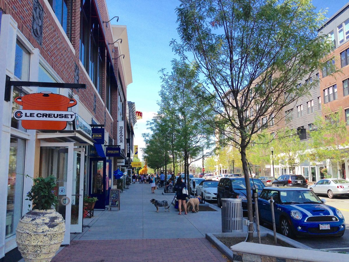
Get this piece of urbanism right, and the neighborhood environment improves dramatically, along with people’s sense of being in an attractive, lively place, as demonstrated in this image from Assembly Row in the Boston suburb of Somerville. (And, yes, that is a giraffe you see in the distance, made from Lego blocks.)

None of these factors are dealt with effectively by conventional zoning, which has for more than 90 years been exclusively obsessed with use, leaving little room for issues of design, building frontage or community character.
Planners traditionally weren’t taught about urban design, so it was no surprise that 25 years ago some architects broke with their own training and started work on a different kind of zoning based on urban design, not building use. Those architects revived good urban design principles and brought them to the fore, making use of secondary importance, and allowing uses to mix, just as they did for generations in traditional American towns and cities.
The new approach is known by a nerdy term, “form-based zoning,” but it’s better described as “community character zoning,” where the primary focus of regulation is how well new development fits into the evolving character of a neighborhood or district. Instead of talking about abstractions like zones B-1, UR-2, MX-3, etc., we refer instead to “Main Street,” “neighborhood center,” “neighborhood edge,” or “mixed-use corridor.” People know what these terms mean.
Community character codes based on the different experiential qualities of neighborhoods and districts are by far the best tools to bridge the gulf between urban planning and urban design. This requires that strong, community-driven urban design principles be integrated into zoning ordinances in ways that mesh with development logic. Many cities have already moved in this direction, including Nashville, Miami and Denver, three of Charlotte’s main competitor cities. Charlotte is just beginning to think about improving its crazy zoning code.
Achieving this urban design quality is not about fancy materials. Instead it’s about understanding communities at many scales, from whole neighborhoods down to individual blocks, and ultimately focusing on the intimate spaces we inhabit daily—walking to work or to shop or home, waiting for a bus or streetcar or train, or simply sitting at a sidewalk café. All that activity occurs within the “Golden Triangle.”
Using the Golden Triangle concept, let’s examine two recent buildings in the heart of Plaza-Midwood on Central Avenue. One tries to fulfill its role of improving public space. The other simply doesn’t care and actively damages our public realm. Under today’s zoning both are legal. But under a proper form-based zoning code one building would need some slight improvements to gain approval while the other would not be permitted without a major redesign.
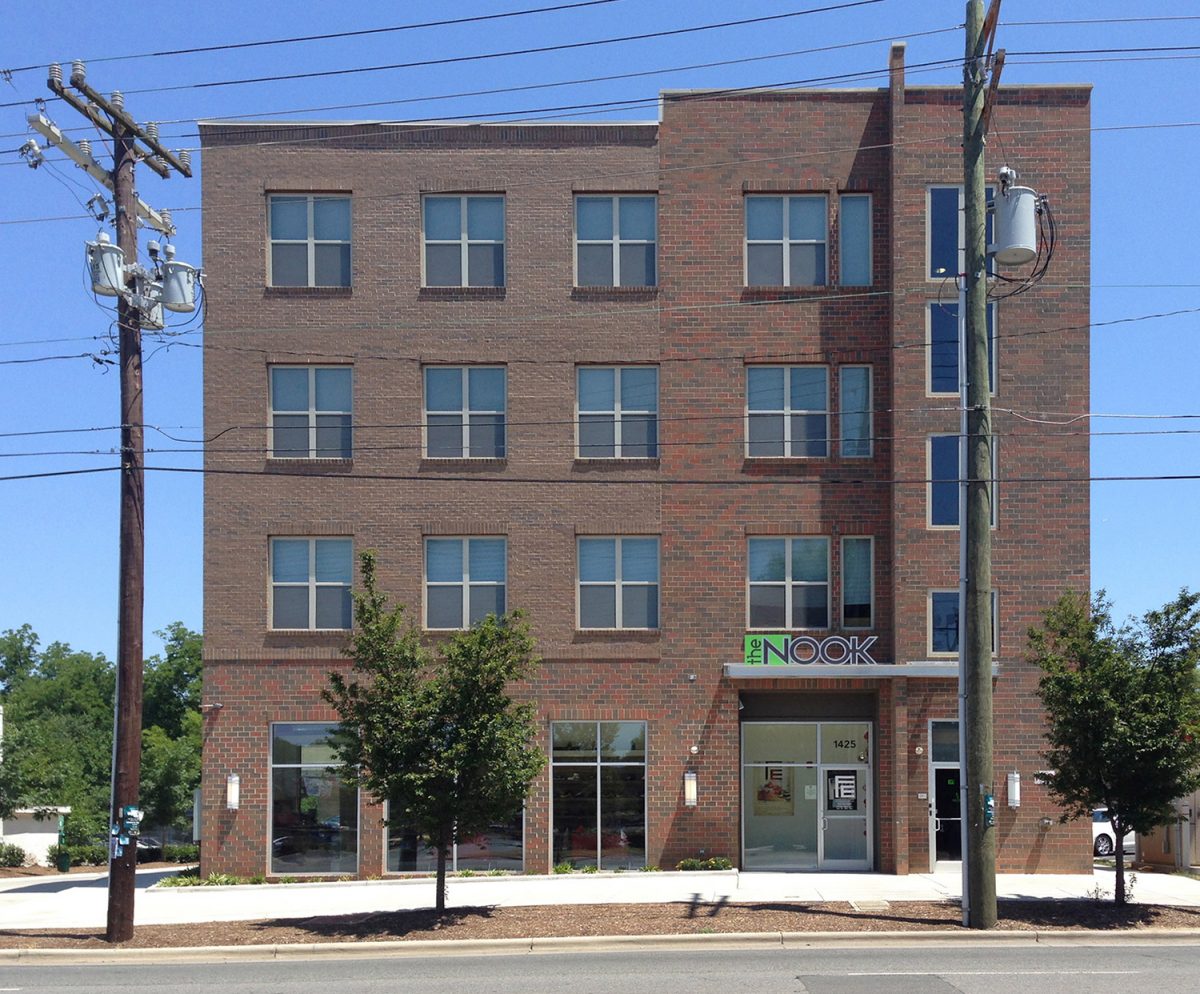
The first building has a retail space at sidewalk level and good façade transparency, meaning people can look in and see out, providing visual interest and a greater sense of security. It’s a shame the apartments don’t have balconies on the street front to add activity to the street and articulation to a flat façade. (Balconies are on the side.) This omission from the Golden Triangle diminishes the effectiveness of this building. And the design of the city street out front is awful.

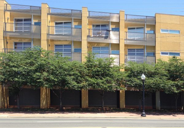
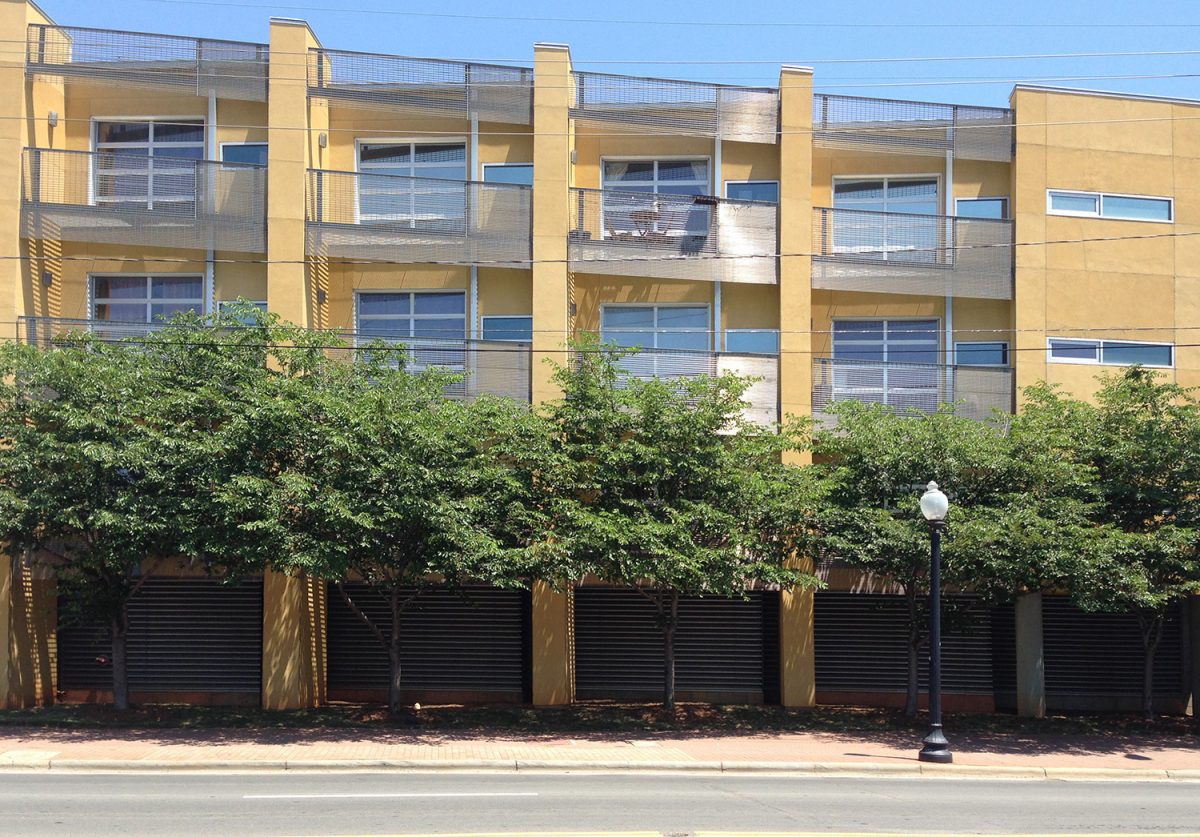
The second example, a few blocks away near Zada Jane’s restaurant and its lively patio, is a mini-disaster. The industrial metal grating looks like prison detailing—hard and unfriendly—and negates the otherwise positive effect of street-facing balconies. The clunky dividing walls block views to uptown and create a thudding rhythm that fights with the scale and context of other buildings along the street. Worst of all is the sinful treatment of the pedestrian level. Instead of transparent façades to create interest and aid pedestrian safety, we have blank, hostile grilles to parking spaces. The recessed bays create dark nooks for suspicious lurking, or worse. That’s scary and dangerous. That this building sits on one of Charlotte’s few attractive pedestrian areas is an act of urban vandalism.

Form-based zoning, or “community character codes,” would see those kinds of design mistakes banished from Charlotte’s neighborhoods in future development.
As an incentive, developers and their architects get a lot more market flexibility from form-based codes, but the quid pro quo requires them to pay more attention to community character and to upgrade their design skills. That’s a bargain that can seal a sustainable and attractive future for Charlotte.
David Walters is an architect and town planner, a UNC Charlotte professor emeritus who recently retired as director of the university’s Master of Urban Design program. Opinions in this article are not necessarily those of the UNC Charlotte Urban Institute, its staff, or the University of North Carolina at Charlotte.