Charlotte has had four main uptown libraries. What do they tell us?
Charlotte is a city with a reputation for tearing down its old buildings to replace them with the next big thing, and perhaps nowhere is that go-go approach to development more apparent than at the site of the Main Library.
The corner of Sixth and North Tryon streets has been home to three main library buildings since 1903. The fourth is on its way: Plans unveiled this month by the Charlotte Mecklenburg Library for the new iteration show a truly transformative concept, a $100-million building that will be a major showpiece for the city and vastly more appealing for both library patrons and pedestrians.
[Photo Gallery: Main Library through the ages]
It will also be a far cry from the stately Carnegie Library that once occupied the site. To look at what the history of the Main Library buildings says about Charlotte’s past and future, I spoke with David Walters, an architect, professor emeritus and former director of Master of Urban Design Program at the UNC Charlotte College of Arts + Architecture.
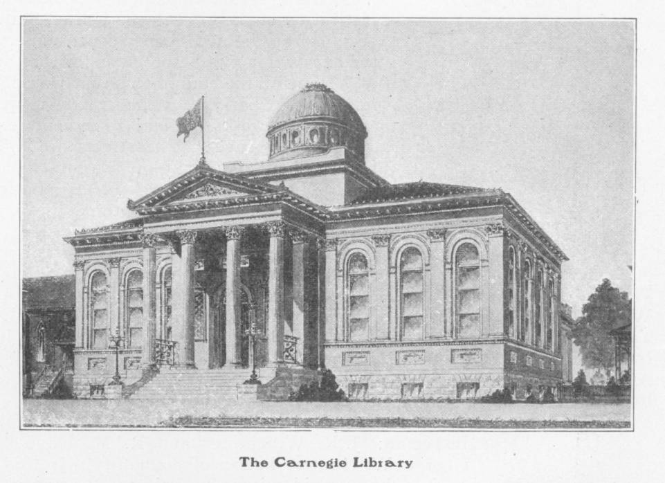
1903: The Carnegie Library

A postcard showing Charlotte’s original Main Library building. UNC Charlotte, Atkins Library, Special Collections.
Steel magnate Andrew Carnegie funded the construction of more than 2,500 public libraries worldwide, including in Charlotte, where he donated $25,000 for the new building. The library opened in 1903 with 2,526 books, according to the Charlotte Mecklenburg Library system. A separate library for black Charlotteans was built at Brevard and Second streets, in the Brooklyn neighborhood, in 1905.
The Carnegie Library’s classical facade brings to mind a temple, Walters said. The elevated entrance separates the library from the ordinary world of the street.
“You climb the stairs to this higher realm,” he said. The building was ornate, imposing and designed to project an image of the rarefied air of learning and scholarship. Bestowed upon Charlotteans by one of the richest men in the world, the building also carries overtones of paternalism and a sense of noblesse oblige.
“It was an era of privilege…We now say ‘isn’t that lovely,’” said Walters. “We would fawn in front of it, if it were still here. Architects and elected officials tore that stuff down without a second thought.”
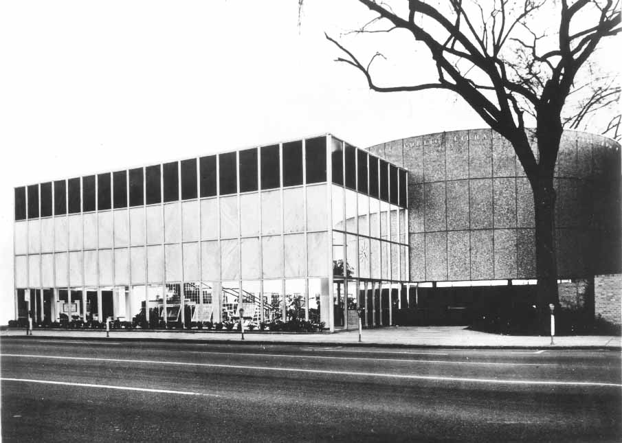
1956: A modern era

The 1956 Main Library that replaced the Carnegie Library reflected a vastly different aesthetic. Photo: Charlotte Mecklenburg Library Spangler-Robinson Room. 
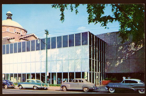
The 1956 Main Library. Photo: Charlotte Mecklenburg Library Spangler-Robinson Room.
Despite its grand style, the Carnegie Library barely made it past the age of 50. In 1951, voters approved bonds for a larger replacement to better serve the fast-growing city, and the Carnegie Library was soon demolished. In 1956, a new, $1.1-million building opened on the same site. It was larger, racially integrated and reflected a totally different style and way of thinking about public buildings.
Walters said that while we might wince today, he appreciates the “delicious clarity” of the design.
“The lack of ornamentation is completely intentional,” said Walters. “It is not a terrible building by the criteria of its time…Good architecture was true to materials. That is a very honest building.”
“What you see is what you get,” said Walters, pointing out the transparent building and the visible structure. “The 1950s building takes away all the drama, all the pomp. It says here we are, you can see, come on in.”
In the intervening decades since the Carnegie Library opened, Walters said, elaborate ornamentation fell out of style, replaced by modernist architecture and schools of thought like Bauhaus that taught form should follow function. Ornamentation came to be seen as wasteful, decadent, even immoral.
Austrian architect Adolf Loos gave an influential lecture, later published, called “Ornament and Crime.” It exemplifies such thinking.
“The modern man who tattoos himself is a criminal or a degenerate,” Loos said, showing his contempt for even bodily ornamentation. “Tattooed men who are not behind bars are either latent criminals or degenerate aristocrats. If someone who is tattooed dies in freedom, then he does so a few years before he would have committed murder.”
The generations of buildings that followed largely reflected that ethos, viscerally rejecting the types of ornaments and facades that made the Carnegie Library building look grand.
“That very weird idea of ornamentation married the functionalism of Bauhaus,” said Walters, becoming the predominant thinking in design.
And when he was a young architecture student, Walters said, such designs were the path to success: “If my buildings were honest and the design was functional, then my building would be beautiful.”
1989: Growing again

The current Main Library opened in 1989. Photo: Ely Portillo 
A fountain dominates the plaza of the current Main Library site. Photo: Ely Portillo 
The tunnel that frames part of the sidewalk along Sixth Street. Photo: Ely Portillo
While the breakneck pace of Charlotte’s growth continued, the lifespan of its Main Library buildings shortened. In the 1980s, the 1956 building was completely renovated and doubled in size with a three-story addition. It reopened in 1989.
The new building reflected an attempt to better interact with the street and create a public realm outside the library doors, Walters said, but it also reflected design conventions of its day. At the time, Walters said, public space was mostly seen as something architects shouldn’t worry about too much, since the majority of their focus should be limited to the building walls and what went on inside them.
“It tries to engage public space, but we didn’t really understand public space,” said Walters. The attitude was: “Get a landscape architect to put a tree somewhere.”
That led to design choices in the public space that Walters said compromise its functionality and appeal. For example, a large fountain dominates the plaza at Sixth and Tryon streets, which Walters said was a “standard move.” It can be pretty, but the fountain takes up a big chunk of real estate and doesn’t offer anywhere to sit or gather.
Instead, it all but guarantees a plaza that’s perpetually mostly empty of people.
“When you look at most old cities, there’s nothing in the middle (of plazas),” he said. “The space is for people.”
The quote-lined tunnel that takes up half of the available sidewalk on Sixth Street is another example. Walters said it creates a confusing public realm — dark, unappealing and half cut-off from the street. It’s not immediately clear how you should enter the building, or where the sidewalk ends and the library’s space begins.
“How do I leave the street?” Walters said. “Should I be inside or outside the tunnel?”
2024: A new vision

The new library, adjacent to Spirit Square. Design Architect: Snøhetta; Architect of Record: Clark Nexsen; Rendering: LMNB 
The new library entrance. Design Architect: Snøhetta; Architect of Record: Clark Nexsen; Rendering: LMNB
The current library building looks destined to have the shortest lifespan of all the iterations, with construction on a new building expected to start on the same site in 2021. That’s just 32 years after the 1989 building opened.
The new, $100 million building is planned to open in 2024. The design includes a cafe operated by a vendor, two immersive theaters, two outdoor terraces (on levels two and five), a main entrance on North Tryon (instead of Sixth) Street, more meeting spaces and an active lobby with activities to draw people from the street. The building will include five stories aboveground and one below.
“The new main library will be an architecturally-distinctive, state-of-the-art, technologically-advanced knowledge center and public commons, where everyone in our community can access the resources of a 21st century library, use them to learn and grow to the best version of ourselves, connect with others and participate in the public life of our community,” said Charlotte Mecklenburg Library CEO Lee Keesler.
The new building incorporates some of the good design elements from each of the past eras in different forms, Walters said.
Like the 1903 building, its entrance is elevated, providing separation from the street — though not as starkly as the temple-like entrance.
Like the 1956 building, large glass windows allow people to see and invite them to come inside — though they don’t cover an entire wall of the building.
And the new library building pays more attention to the public realm, with areas to sit and gather that are lacking in the 1989 building — as well as interior public gathering spots like the cafe and terrace overlooking the street.
“Overlooking the street has always been a popular thing,” said Walters. And while he said he generally abhors the hollow “world-class” designation, the new library building would qualify.
“They certainly have an elegant-looking building, which is such a relief,” he said. “Uptown is going to have to up its game.”