How green is your ZIP code? Charlotte’s carbon footprint
The carbon footprint of a household can vary greatly based on income and location. Researchers from UC Berkeley included these factors in a new analysis. The result is a set of interactive maps that show carbon footprints based on ZIP codes.**
Household greenhouse gas emissions are lower in central cities compared to suburbs, but the overall size of a metropolitan area matters. Even with lower carbon footprints in central cities, the extensive areas of suburban development typical in large metros cancels out the benefits of lower central city carbon footprints.
|
What is a carbon footprint? Carbon footprint is a measure of the greenhouse gases produced by an organization, event, or, in this case a household. For more background on carbon footprints click here. More information about the study referenced in this article, including the study’s methodology and what it may mean for urban planning, is here. |
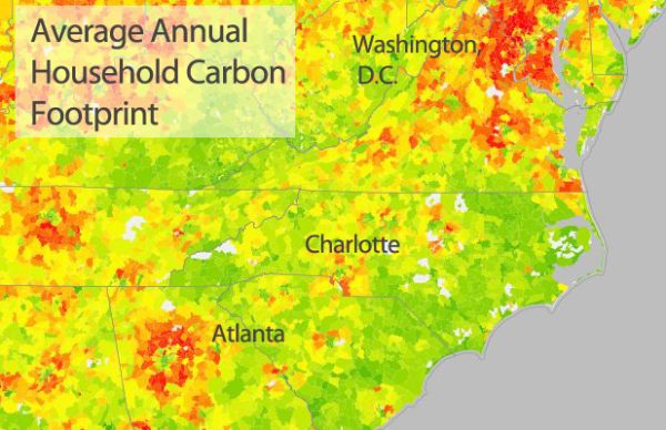
The map above, from the UC Berkeley CoolClimate Network, illustrates the point. The map as reproduced above is centered on Charlotte, whose carbon footprint is dwarfed by the large pattern of high-carbon ZIPs surrounding Atlanta to the southeast and the Washington–Northern Virginia area to the northeast.
The geographic pattern within the region is also different in Charlotte when compared to metro areas like Atlanta, Birmingham and Nashville. Charlotte does not show a widely dispersed pattern of high-carbon footprint ZIP codes in all directions around the center city. Charlotte’s pattern of high-footprint ZIP codes is more evident north and south of the city. Raleigh’s pattern is similar, with more specific directions from its center showing higher per-household footprints (North Raleigh and Holly Springs). (Click here to go to the interactive map)
Overall, suburbs contribute roughly 50 percent of total U.S. household carbon footprints, according to analysis from UC Berkeley. Their work suggests that to be successful, strategies to reduce greenhouse emissions need to match the geography and household type.
The interactive maps allow viewers to explore three categories of carbon footprints: the average household footprint (shown above), household energy carbon footprint and transportation carbon footprint. The ability to compare those components of carbon footprints allows for more detailed understanding of the differences between urban vs. suburban areas. Transportation (travel of any kind) is typically the largest component of a household’s carbon footprint, so the transportation carbon footprint is especially useful in understanding how things like commuting patterns affect household carbon emissions.
![]()
The map above shows high transportation carbon footprints in several ZIPs with large numbers of commuters into Charlotte and Mecklenburg County. Highlighted is one in Union County (Waxhaw ZIP code 28173). Among other ZIP codes with high transportation carbon footprints are Fort Mill, McConnells and Hickory Grove in York County, S.C.; Midland, Harrisburg and Mount Pleasant in Cabarrus County and Stanfield in Stanly County.
To see more detail on the way carbon is used in an individual ZIP codes the UC Berkeley group also provides the CoolClimate Calculator. This online tool allows users to see local average footprints and create a customized greenhouse reduction plan.
Below is an example of the average carbon footprint from a two-person household in south Charlotte’s 28211 ZIP code with a gross household income of $80,000 to $99,999. The U.S. average for this size and income household is 58 tons of carbon dioxide (CO2) a year, so this ZIP is near the national average (scroll to the end of this article to see the U.S. average graph for this household size and income).

The Fort Mill, S.C., ZIP code 29708 (graph below), has one of the highest carbon footprints in the Charlotte region (for the same household size and income). Note that the transportation category is where much of the difference in carbon footprint occurs compared to the in-town ZIP above.

Explore these interactive maps for anywhere in the U.S. at http://coolclimate.berkeley.edu/maps. Look at the detailed breakdown of carbon use for specific ZIP codes at http://coolclimate.berkeley.edu/carboncalculator.
For reference, the carbon footprint for the same household size and income as those referenced above for the U.S.:

* Maps and charts in this article were produced using the CoolClimate interactive maps and calculator. Source: UC Berkeley CoolClimate Network, Average Annual Household Carbon Footprint (2013), CoolClimate Calculator Copyright © 2013, Regents of the University of California, University of California, Berkeley. All rights reserved..
** Note: the maps use ZIP code tabulation areas or ZCTAs, click for more information.