Quality of Life Explorer: Making data intelligible and available for journalists (like me!) who aren’t PhDs
By Ely Portillo
What neighborhoods in Charlotte have a high share of renter households, and where are people most likely to own their homes?
What parts of the county have the highest concentration of babies with low birth weights?
Where can you find two adjacent communities with a nearly three-decade difference in average lifespans?
If you’re a journalist like me and you want to answer these questions, you have three basic options:
- Figure out where the data lives, as well as how to download it, process it, map it and understand it.
- Ask someone much smarter and better with numbers than you are to do that for you.
- Or click on the Charlotte-Mecklenburg Quality of Life Explorer.
It’s probably no big surprise that I’ve always opted for the third option here. I don’t remember when I first discovered the QoL Explorer, but it would have been sometime during the decade I spent as a reporter at the Charlotte Observer. With interactive, embeddable maps, customizable reports and — crucial— context to help make sense of it all, the QoL Explorer has been a valuable tool for me in reporting stories.
In 2019, I joined the UNC Charlotte Urban Institute to work on communications and strategic partnerships. This gave me a peek behind the curtain at how the explorer comes together. And it gave me the chance to tell more people about one of my favorite data tools, including through stories we published to go with each release of a new or updated set of maps.
Those stories were usually some of our most popular. Everyone (or at least somewhat nerdy folks with a penchant for local news) loves an interactive map.
In 2022, I became WFAE’s senior editor for news and planning. In this role, I work both on our daily coverage and shaping long-term stories and projects. I continue to proselytize about the QoL Explorer (I know, at this point I’m starting to sound like a multi-level marketing salesperson – don’t worry, there’s no pitch for a subscription coming here) and use it in my day-to-day reporting and editing.
Here’s a look at three things I think the QoL Explorer is especially useful for when it comes to local journalism, and, by extension, for our ability to understand and react to Charlotte-Mecklenburg’s challenges:
The QoL Explorer allows journalists to easily identify trends in the data about our community.
One of the most powerful things about putting hundreds of thousands of pieces of data on a map is that it becomes simple — intuitive, really — to see the points of commonality, the overlap and the trends. Otherwise dry numbers leap to life when we can see them plotted spatially.
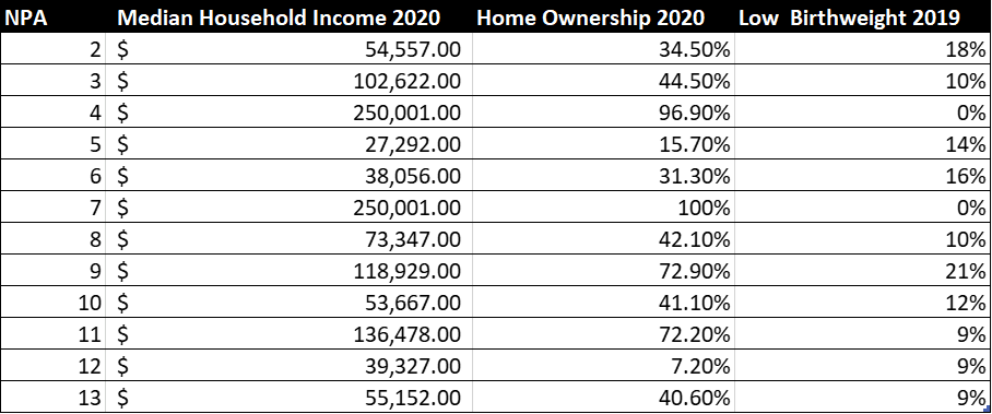
Just try comparing the racial makeup of neighborhoods, average income, home ownership and low birthweight through these data tables. It’s OK, we can give you a few minutes.
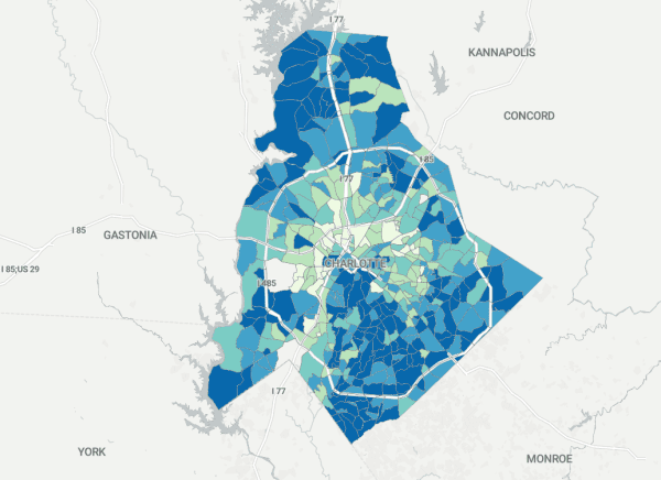
Let’s do the same with a few maps.
With the data mapped, it becomes much easier to spot the trends, commonalities and differences in different areas of Charlotte. Patterns like the near-omnipresent “crescent and wedge” show up again and again. Perhaps even more instructively, there are outliers, places we can look to and say “why are these areas different?”
Finding those areas where data that, on the surface anyway, are vastly different is tough when you’re staring at charts. But on a map, plotted out visually, they snap into focus.
The QoL Explorer is a force-multiplier in an era of diminished local resources.
It’s no secret that local journalism has been hit hard in the past two decades. Newsrooms that once numbered in the hundreds now count their staff in the dozens. While many new publications have sprung up, and other less traditional outlets have beefed up, they still generally don’t match the size of the metro daily newspaper newsroom from 20 years ago.
That can make it harder to do things like digest data, map it, and create graphics – especially high-end, interactive, embeddable graphics. While some newsrooms have that capability, not everyone does. And contracting out that work is often expensive.
Enter the Explorer. With more than 80 maps that are free, easy to share and embed, and backed up with open data and plenty of context, this tool has already done a lot of the heavy lifting. And it’s not just journalists who can benefit from this: The Quality of Life Explorer is a resource that community groups, local officials and people in the community can use to create and share maps they otherwise almost certainly wouldn’t have the time and technical know-how to create on their own.
The QoL Explorer helps us ask the right questions
Let’s circle back to one of those original questions: Where are two neighborhoods located next to each other that have a decades’ worth of difference in average age of death?
Trying to compare the ages of death across different areas on a table is instructive, but dry. And it’s certainly not intuitive. Here’s what that looks like:

It’s hard to ask that data table any questions, if you don’t know what you’re looking for.
Now, look at it plotted on a map below. The questions practically leap out of the screen.
Zoom in to Eastover and Grier Heights — right next to each other, flanking Randolph Road. Two neighborhoods — one of the city’s wealthiest and one of its most impoverished. One mostly white, one mostly Black.
Average age of death in Eastover: 78
Average age of death in Grier Heights: 54
There’s a story there. And not just one story, but many — stories about income inequality, disparities in healthcare, unequal access to resources. Stories about people living with the consequences of decisions made decades ago. Stories about where Charlotte’s been, how we got here, and where we’re going.
Looking at that map, it’s hard for me not to wonder: How could this be? What’s driving this? And how can we start to change it?
The QoL Explorer doesn’t always have the answers. But it can prompt us, as journalists, to do the most important thing: Ask the right questions.
Ely Portillo, WFAE