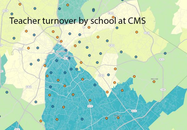
Maps compare teacher turnover at CMS schools

Increasing teacher turnover has been in the news for districts across North Carolina. The Charlotte-Mecklenburg Schools district is no exception – but what does teacher turnover look like when you get down to the individual school? Interactive maps and dashboards give you a new perspective.
The UNC Charlotte Urban Institute has partnered with MeckEd through our Charlotte Regional Indicators Project to create interactive data tools for exploring educational data for Mecklenburg County.
The dashboards below focus on teacher turnover at the school level in CMS. Select the gray boxes near the top of the dashboard to see other views of the data or more information.
The top dashboard shows two maps with school data on top of a view of income for the county by ZIP code. The darker colored areas reflect higher per capita income. The map on the right shows the new READY proficiency scores by school. There is a clear pattern in the way schools in higher income areas tend to score above the district average. The map on the left shows that those same patterns don’t hold as well for teacher turnover.