The ups and downs of Charlotte housing prices
|
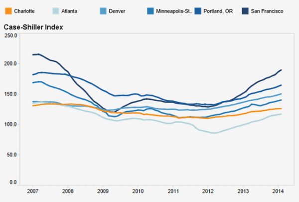
Charlotte never experienced the dramatic housing bubble seen in other places in the country, but the local market is still under its August 2007 peak as measured by the Case-Shiller Index. Explore our data dashboard (below) to see Charlotte’s highs and lows and how they compared to places like Atlanta, Denver and San Francisco. (Scroll below dashboard for more information.) |
|
Data Dashboard:
| Learn moreThe data above are from Standard & Poor’s Case-Shiller Index. The index tracks repeat-sale housing prices in select metropolitan areas. (Learn more about these indices). Note: Data shown represent seasonally adjusted figures. |
The data dashboard above (part of our extensive local and regional data for Charlotte) compares Charlotte’s metro area (MSA) to a set of benchmark metros for several measures. These benchmark metros were picked to give a range of locations around the country with characteristics of interest. (Note: not all the cities used as benchmarks throughout the website are tracked by Case-Shiller.)
The housing dashboard contains information back to 1987 and allows for quick and easy adjustments in the period shown by sliding either (or both) of the end markers in the timeline to narrow the dates shown.
Notice that all lines in the graph above converge on 100 in January 2000. The index is designed so that all the local home prices are normalized to that value so that the comparison changes among metros across the country are easier to interpret.
The dashboard features also allow you to easily see highs and lows in the table below the graph. Click any city name in the table and you can resort the whole list to see the highest or lowest value for any city. Sorting on Charlotte, you will see the high value is August 2007 (133.9). That compares to the value from February 2014 of 126.2.
If you slide the left bar to reduce the number of years displayed on the graph to more recent years, for example, 2006 to 2014, it is easier to see some recent trends among the peer metros in the dashboard (graphic shown at the top of the article). Comparing pre- and post-recession index values, there were several changes. Charlotte had the lowest index value in 2006, but Atlanta’s is the lowest in the group in 2014. San Francisco is still in the top spot, but has had the most volatile set of index values through those years. Denver, Minneapolis and Portland have also moved around in the relative positions over the period.
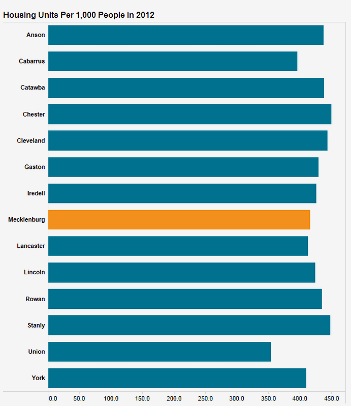
The second tab in the dashboard above allows for comparison in housing units per 1,000 population among the same set of benchmark cities, or between Charlotte regional counties. Scroll below to see an example of data comparisons among counties focused on Charlotte’s home county of Mecklenburg. Similar sets of data dashboards are available that focus on each of the 14 counties in the graph below.
Dive in and explore more about housing in these dashboards or branch out to investigate other topics from the regional data homepage.
Another example of data comparisons available in the dashboard above (Housing Stock tab).