Tracking neighborhood trends just got easier

Since 1993 the City of Charlotte has tallied information about some (and in later years all) city neighborhoods, in its regular Quality of Life reports. But this year major changes are afoot for the project, which opened its online doors to the public on Monday.
The report now covers all of Mecklenburg County, and it’s online in an interactive format, with greatly expanded information. UNC Charlotte’s Owen Furuseth, associate provost for Metropolitan Studies and Extended Academic Programs, has worked with the city to create the report since 1997. In a recent interview with UNC Charlotte Urban Institute Associate Director Mary Newsom, he talks about the project’s history, changes over the years, and the big changes for this year’s report. His edited remarks:
|
Find out more about the Quality of Life project and links to new resources: click here. A new tool to help find your neighborhood is here. |
Q. What’s the Quality of Life Dashboard project, in a nutshell?
A. It is a compilation of data that represent, broadly speaking, what is the quality of life at the neighborhood level. The data are geo-coded for 464 neighborhood profile areas which are linked to existing community organizations and their boundaries.
Q. What’s the background?
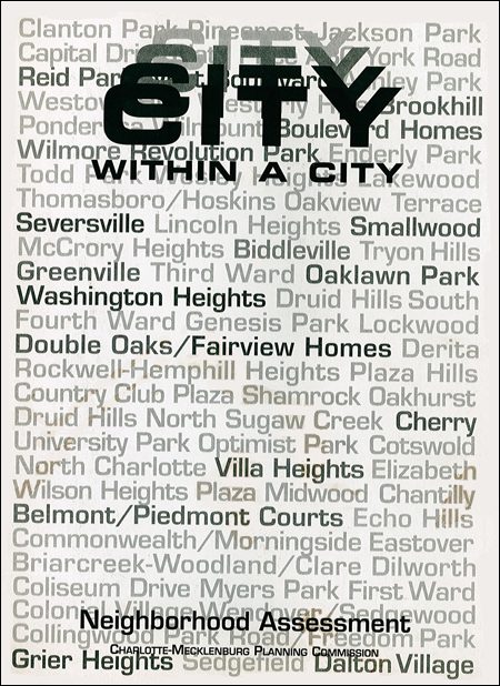
A. The whole thing started in 1993, when the city recognized that if Charlotte was going to prosper as a city, its inner-city neighborhoods needed to be healthy – socially, economically, and demographically. The Charlotte-Mecklenburg Planning Commission identified what it called the “city within a city,”
73 neighborhoods within a 3-mile radius from the intersection of Trade and Tryon uptown.
 The City Within A City (CWAC) neighborhoods were very eclectic; they were the old silk-stocking neighborhoods of Eastover and Myers Park and some up-and-coming ones like Plaza Midwood, Elizabeth and Dilworth, and traditional, historically African-American and low-income neighborhoods on the west, north and south side: Beatties Ford Road, Cherry and Biddleville, places like that.
The planning staff extracted available data – crime data, maybe some social services data, and paired it with census data. They constructed metrics for those neighborhoods and broadly labeled them, like a traffic light, red, yellow and green, or fragile, threatened and stable.
In 1997 they asked UNC Charlotte to help update the CWAC study with more contemporary, local data. So we looked at places like Seattle, Portland and Toronto and compiled an extensive list of quality of life variables. We eliminated variables that made no sense. For example, in Seattle one variable they use is the salmon returning upstream to spawn. We didn’t see Sugar Creek as having a salmon option.
We eliminated variables where there was no available data. That pretty much took all the environmental variables off the table, because we didn’t have geo-referenced data to measure things like water and air quality, or tree canopy.
We held public meetings around the city, asking, “What makes sense in terms of quality of life in your neighborhood?” We ended up with 27 or 28 variables broadly grouped into four categories: social, crime, physical, and economic. We came up with a methodology so they could all be compared. We weighted the four groups and combined the variables into a single composite measure. The scores allowed us to compare the neighborhoods across the city.
|
For more information To see the Quality of Life studies from 2002, 2004, 2006, 2008 and 2010: click here. |
In 2000 we went citywide, from 73 to 173 neighborhoods. We dropped our variable mix to 20, to be more efficient.
Q. What’s different this year?
A. This year we’ve gone from riding horseback to getting a car to zip down the road.
We’ve made significant improvements. We’ve gone countywide, we have new boundaries for the neighborhoods, there is a more detailed geography and we have vetted it with citizens.
Specifically, we have grown from 173 neighborhood statistical areas to 464 NPAs – Neighborhood Profile Areas – averaging around 1,900 residents per NPA.
We did new boundaries for the NPAs, using the census block group as our fundamental geography. We combined census block groups, but we looked at the older reports’ neighborhood boundaries and at boundaries from the towns and the planning commission. We spent months. We had maps spread all over the place, looking at how census tracts or block group boundaries line up with neighborhood boundaries. The process was incredibly labor intensive.
Then we had more public meetings around the city and county. We’d walk in with maps showing the old Quality of Life Study boundaries and the proposed new boundaries for neighborhoods. We gave people colored pencils and said let us know where you don’t like this.
Q. What other big changes came this year?
A. We went from 20 variables in four categories to around 80 in eight categories. We’ve been able to do this because the Census Bureau’s American Community Survey data is now produced to the block group level.
One area I’d point out in particular was environmental variables. We went from having no environmental variables to having 16. And remember, we had 20 total last time. We’ve got things like commuting behavior, public transit use, length of commute, tree canopy, solid waste diversion rate and recycling.
The real crown jewel is that we’ve got residential energy usage, which no one else in the country has. I am so proud of that. That’s thanks to Rob Phocas [the city’s energy and sustainability manager] and the cooperation of Duke Energy and Piedmont Natural Gas.
The other significant enhancement is the dashboard – this innovative, fabulous website that is going to allow anybody to go in and to pull up neighborhood data to do comparisons, to select data variables and to run quantitative analysis. It blows you away. (To see it click here)
Q. But the 2010 report was online, wasn’t it?
A. Yes (click here), but you can only look at the maps. Now you can do your own analysis. This was done by the Mecklenburg County GIS staff, a great, very talented group. This is on open-source software, done at a very low cost. The project really benefited from having Tobin Bradley [a county system architect] and that group who was doing that.
A tech-savvy sixth grader will be able to sit at home, pull up the dashboard, and do a class project about tree cover in Charlotte, or on crime. It will put in the hands of average citizens the latest, best information, in a format they can manipulate and use. It will really empower them.
Q. Based on the results, what are the big headlines for the future of the city and the county?
 A. When you look at the data, some of the common expectations you would have – from just turning on the news at 11 or what you think you know about Charlotte – don’t hold up: for instance, that the west side is always the poor side of town, the southeast is always the rich side, or thinking areas that are affluent have no problems. Things are not quite as divided up by east-west or south-north, as you might have thought.
And as kind of a data geek, for me the exciting thing is that we can begin to raise complex questions and issues. That’s the real power of this. It’s going to allow us to think about issues as complex rather than simplistically.
Q. This year neighborhoods aren’t labeled as stable, transitioning or challenged. How will that change the way people use the information?
A. That was not a change we came to easily. There was a lot of debate. For all of its problems, it did give us a community-wide metric so over time we could see a neighborhood like Belmont go from fragile or challenged up to stable. We could look at east side neighborhoods that have been stable and all of a sudden began to slide downward. There was value to it.
But that term reinforced stigmas about affluence and wealth and lack of wealth. Neighborhoods felt they were not adequately represented.
Now we’ve given neighborhoods the power, with the information, to decide how they define quality of life, pick variables that represent it, and measure it against those variables. If you’re Plaza Midwood and what you think is important is public transit, tree canopy, energy conservation and so on, then you say, this is how we’re going to measure progress for the next 10 years, and you’ll have the data to do that.
Q. Could you take the new environmental variables, for example, and after a period of years start looking, again, at trending up and down?
A. Absolutely. But for now, with the new geography and the new variables, going forward we lose the ability to compare all the new data with the data we’ve had until now, which is a big loss.
Q. Could you pick a topic area, as an example, and give people a glimpse of what they can do with it?
 A. Let’s do food deserts, a topic that’s gotten a lot of attention. The average for Mecklenburg County is that 26 percent of the population is within a half-mile of a chain grocery store.
Think about food deserts, and what comes to mind is low-wealth, minority neighborhoods. Sure enough, when you look at the map, there are concentrations in the west side, down South Boulevard. But then you also see them on the east side, in the southeast on the county line, and up in the north. This reflects auto-centric subdivisions. It challenges our image of where a food desert is.
We know grocery stores don’t go into low-wealth neighborhoods because they don’t think they’d make money. But what’s the explanation for food deserts near Ballantyne, or in Cornelius or Huntersville? There, it has to do with design issues.
So if you lived in an area that’s a food desert, you could go on the dashboard, select other neighborhoods with the same absence of stores, and see how they are similar or different from you. You might wonder if there’s a relationship between food deserts and residential density. You could pull out both variables and click on a button, and it would do a graphing analysis and show the relationship between variables.
Q. Will there be an update in 2014?
A. That’s the plan – to continue the biannual process.
Q. Do other cities in North and South Carolina have this type of stuff?
A. Nobody has this, not the whole package – nothing to this degree of specificity and this degree of currency.